A new Squarespace 7.1 site for Purdie Pascoe
The challenge here was to transpose the look and feel of an existing Joomla site that we'd built for PP years previously onto what can be a fairly restrictive template (at least in terms of complete layout and styling freedom).
Purdie Pascoe is a medical devices market research company with a truly global reach. As clients, friends and neighbours here in Battersea, they’ve been trusting us to take care of their Digital Marketing for over 10 years now.
The original Squarespace challenge - a few years ago now - was to transpose the look and feel of an existing Joomla site that we'd built for PP some years previously onto what can sometimes be a fairly restrictive template (at least in terms of complete layout and styling freedom).
The client quite rightly wanted to enjoy their existing design but with an easier and more intuitive CMS as well as decreased maintenance and hosting costs and what we achieved was a near perfect facsimile of their previous site (whose design the client was very attached to) without having to resort to too many CSS and Javascript overrides
Since then Squarespace has moved on leaps and bounds and with the recent release of Squarespace 7.1 we took the opportunity to redesign and build a brand new site that benefits from better navigation and user journeys. The new site is a far simpler affair that also delivers a far more sophisticated and appropriate face for their business.
Take a look at our work here >>
“Our relationship with 3B goes back a decade. In that time we’ve grown as businesses together, and it’s been reassuring to know that 3B have been in our corner every step of the way.
A recent rebranding exercise was greeted enthusiastically by their team and we were gratified that our new ID could so easily and quickly be adopted by our site’s existing CMS.
3B are a trusted and valued addition to our marketing team.”
Stephen Potts, Director, Purdie Pascoe
RedDoor Homes - a site that features rich and dynamic content
RedDoor Homes came to us with a beautiful but a very slow website. They explained to us their USP - creating engaging video content to help prospective & existing clients. Their portfolio includes virtual viewings, tips for landlords, tenants, homeowners; reviews of local cafes, restaurants & events.
Being an agile agency we always keep in mind that every website is unique and has to be closely tailored to the client’s needs.
Here at 3B, we know how to adapt our strategy and recommendations to meet the expectations of every client. However, this may be a bit challenging when it comes to working with estate agents, mainly because they often depend on a third-party tool for the property listing.
Quite often, estate agents employ a property listings widget embedded on their site. The problem with these widgets is that they are often not SEO friendly. Some of them display within an iframe - meaning that the properties do not have unique URLs and therefore can not be shared.
RedDoor Homes came to us with a beautiful but a very slow website. They explained to us their USP - creating engaging video content to help prospective & existing clients. Their portfolio includes virtual viewings, tips for landlords, tenants, homeowners; reviews of local cafes, restaurants & events.
To make the best recommendation possible we conducted the full SEO & Site performance audit. The audit revealed a handful of potential improvements. Starting from some pages not being responsive on mobile to missing metadata and having 6 Google Analytics codes connected to the site. All that aside our biggest concern with the RedDoor homes website remained the site being incredibly slow, on both, desktop and mobile.
This often happens with large websites; many people think having a website is enough and they tend to focus more on content management and forget about general maintenance and the optimisation of user journeys and conversions.
When talking through all areas of improvements with the client we hit a roadblock - all property listings were done through a tried party tool called ‘Expert agent’ - a tool that the client was determined to maintain despite the fact that ‘Expert agent’ embedded property listings simply weren't working for this site.
A thorough research process revealed the perfect solution - two websites unified into one online presence; a website for content management on Squarespace & a website for the property listings by ExtertAgent.
To manage brochure content we recommended Squarespace - the perfect solution for those who want to regularly update their site. The interface is very intuitive and the client does not need to have any dev knowledge at all!
When the new websites went live, we were then able to better focus on on-site SEO and especially on one of the most important elements of SEO - copywriting; producing a user-friendly & search engine optimised content.
SEO is a long process. It starts with thorough keyword research, understanding what people search for and industry trends. An optimised page should be at least 750 words long. Having said that there is no point of writing those long, well-optimised pages if people are simply not reading them. To write useful content you need to understand your website visitors and that’s where the tracking comes into play.
Google tag manager plays a very important role in understanding your website traffic, although what needs to be tracked differs from site to site. Here is what we added to the RedDoor Homes website:
Scroll depth tracking - this is key for SEO content and long term strategy. Implementing scroll depth tracking allowed us to see how much of the page people read (25%, 50%, 75%, 100%). Analyzing this data helps to understand what pages people don’t find particularly interesting or easy to read - then more work can be done to make those pages perform better.
Video tracking - the site has many videos and tracking them allows us to see the videos that have been watched, which ones were the most popular if the people watch the whole video or give up halfway through.
Outbound link tracking & link clicks to services provided by RedDoor - almost every website has links to other platforms, it is important to see where people click off to from your site. In this case, we also wanted to know how many people use ‘off-site services’ such as online property valuation, repairs and maintenance platform etc.
Tracking of form submissions - allows us to see how many times people contacted RedDoor using contact forms on the website. It allows easy analysis of what pages have higher conversion rates.
Reading all this, you probably think it’s a lot to digest and not everyone is confident navigating their way through the maze of Google Analytics. Luckily, we know the most common client concerns and we don’t expect our clients to find all the information they might need all by themselves.
To that end we used Data Studio to present everything a client needs to know about their website performance in one beautiful and comprehensive report. The report includes information about the most important platforms for RedDoor - their main website, properties website and YouTube. It also includes the number of sessions, users, bounce rate, page views, number of form enquiries, new / returning visitors ratio, devices people use to browse the site, how people find the site and many more.
We are always open to suggestions, and if a client thinks that they would benefit from something extra added to the report we are keen to help.
“Choosing an agency to carry out an effective SEO strategy is tricky; optimisation seems a dark art to most of us and trust is vital - trust that the agency knows what they’re doing, and trust that they’ll actually do it!
We’ve been associates of 3B for many years now but only very recently invited them to take on our SEO and Digital marketing account. Step one was a brutal but much appreciated audit of our existing website and a recommendation that we migrate our sizable but chaotic body of content to a platform where we could collate and organise it far better in order that we more effectively convert traffic to our site and into our sales funnel.
Just a few short weeks later we had our new site - a more striking but fundamentally simpler site that’s easier to manage and, importantly, easier to market. We’re delighted.
3B are just exactly what they purport to be: a boisterous but effective agency that have our best interest at heart, leveraging their considerable experience whilst keenly adopting new technologies and methods along the way - and we trust them totally!”
Andy Wicking, Director
Visit the site here >>
Squarespace site launch for Robinson Kenning & Gallagher
RKG are a creative and innovative Architectural practice and so had strong but changeable views on design and presentation. Fortunately Squarespace is ideal for the rapid prototyping and deployment and ideas were implemented speedily.
Robinson Kenning & Gallagher (RKG) have been our clients since 2007 - up until very recently benefiting from an ancient but still performing Joomla CMS (a testimony to Joomla’s extraordinary robustness & longevity).
RKG are a creative and innovative Architectural practice and so had strong but changeable views on design and presentation. Fortunately Squarespace is ideal for the rapid prototyping and deployment and ideas were implemented speedily.
The result is an elegant but vibrant presentation of Case Studies and Services that we can now look to further optimise ongoing - both on and off site.
Take a look at Robinson Kenning & Gallagher’s new site here >>
Representing the digital brand of the racing driver Perry McCarthy
Personal brands are understandably emotionally charged personal statements by the protagonists and digital and design agencies tread carefully where content, look and feel are concerned. But 3B saw this as a terrific opportunity to make a bold statement of intent in what is a growing market of sports personalities looking to maximise exposure online.
3B are delighted to play a small part in the ongoing story of this most remarkable of professional racing drivers.
3B offered to revisit Perry’s digital presence on condition that they were trusted to build an optimised site that would deliver managed and manageable content in the most accessible way possible, ensuring site goals and conversions were optimised and tracked along the way.
Personal brands are understandably emotionally charged personal statements by the protagonists and digital and design agencies tread carefully where content, look and feel are concerned. But 3B saw this as a terrific opportunity to make a bold statement of intent in what is a growing market of sports personalities looking to maximise exposure online.
Thankfully Perry understood what we were looking to achieve here and has trusted us implicitly to deliver on our promise. The build wasn’t difficult or lengthy; we used the wonderful and increasingly configurable cloud-based CMS, Squarespace - a truly powerful and rapidly deployed platform that serves all but the most demanding brochure-site requirements. Design was very much led by the well-established Perry McCarthy brand and the high-quality images and video that he has at his disposal.
3B Digital is proud that Perry has placed this most valuable asset in our hands and we feel sure that the site at www.perrymccarthy.co.uk will help him better serve his broad and disparate interest groups.
Visit Perry’s new site here >>
A new Squarespace site for Riverside Tanker Chartering
What singles this particular project out as a deeply satisfactory Squarespace instance is that - for once - absolutely no code injection or css overrides were required; this site is absolutely standard in terms of code and template presets, and this reflected in the fact that it was delivered for less than half of the original estimated cost.
Riverside Tanker Chartering (RTC) have been clients of 3B for many years now - benefiting (up until August 2018) from a robust but ageing Joomla site we'd designed and deployed for them in 2011.
The need for a new site was clear; aside from the fact that their Joomla site pre-dated Responsive sites and mobile optimisation there remained the question of whether Joomla was in fact "overkill" for a site serving a purely "affirmatory" role.
The choice seemed simple to us; RTC's needs fell well within the native capabilities of a standard Squarespace site and they readily accepted our recommendation to move platform. Moreover Squarespace's hosting costs are considerably less than Joomla's and its need for regular security updates - in itself a hefty monthly cost - was negated altogether.
The result is a truly beautiful site - albeit one that loads quickly across all devices (notwithstanding the homepage banner video that loads independently direct from Youtube), features strong optimised images and succinct content with clear conversion paths.
What singles this particular project out as a deeply satisfactory Squarespace instance is that - for once - absolutely no code injection or css overrides were required; this site is absolutely standard in terms of code and template presets, and this reflected in the fact that it was delivered for less than half of the original estimated build cost.
Air Partner's Jetcard US Microsite using Squarespace
Theirs are not the kind of customers who are willing to accept bugs or slow loading pages because their time is too valuable. For this reason we realised that Squarespace would provide the ideal backdrop for a responsive and unique theme, without compromising on the feel of the site.
When Air Partner came to us they told us briefly what they wanted:
- A site which would look completely unique.
- A site which would leave a lasting impression on their younger current and potential customers.
- A site which wouldn't also alienate their loyal customers.
We knew that they'd want an easy admin interface and Squarespace provides that in buckets so we dived straight in. The template Squarespace provided us with was completely ripped apart, reshaped and moulded into the unique site you can see today at jetcard.airpartner.com.
We kept all the features which created an immersive experience like the full width videos and images, then imprinted the unique AirPartner brand upon it.
Consider for a moment the kind of clientele suited to a private jet subscription service with the following perks:
- Guaranteed availability in as few as 24 hours' notice with no blackout dates
- Flight credit that never expires and fully-refundable account balances
- 24/7 global coverage year-round
Theirs are not the kind of customers who are willing to accept bugs or slow loading pages because their time is too valuable. For this reason we realised that Squarespace would provide the ideal backdrop for a responsive and unique theme, without compromising on the feel of the site.
Despite the designs being chopped and changed throughout the creative process we have found the perfect balance between one-of-a-kind and functional.
We look forward to working with and advising on AirPartner's greater family of sites in the years to come.
Brighton College "Remembering the Fallen"
Brighton College have been a client of ours for many years now and we were very happy to pitch SquareSpace to them as the platform upon which to deliver their newly launched online tribute to their fallen alumni in The Great War.
We are huge fans of SquareSpace – the increasingly ubiquitous cloud-based CMS that suits so many of the more simple web projects that we take on. The decision to deploy on this platform can be based on a number of factors, budget being just one; most often we propose SquareSpace to a client as a result of tight deadlines and / or the need for only a short-lived website. Another great advantage is the almost non-existent need for mandatory support ongoing – another requirement occasionally put before us.
Brighton College have been a client of ours for many years now and we were very happy to pitch SquareSpace to them as the platform upon which to deliver their newly launched online tribute to their fallen alumni in The Great War & Second World War.
Beyond these simple factors the requirements were reasonably typical in as much as an elegant site with a simple and intuitive CMS were essential, augmented with galleries, rich media, forms and links – all good stuff! SquareSpace offered a beautiful responsive template with built-in parallax scrolling that seemed perfect.
The main challenge was taking the spreadhseet of 147 alumni names and details and importing it into SquareSpace; the CMS allows for importing from WordPress only and so we had to import the spreadsheet as a blog into WordPress prior to a subsequent export and re-import into SquareSpace… all of which sounds a little more complicated than it was!
We’re delighted with the resulting website… and more importantly so is the client!
Industrial Print Blog - a site built on Squarespace
InPrint & FM Brooks needed a rapidly deployed and easy to manage blog site where they could showcase their thought leadership as well as their exhibitions & shows.
FM Brooks is part of the Mack Brooks Exhibitions Group, one of Europe's largest independently owned industrial exhibition businesses and they launched InPrint Show in 2014 in Hannover.
They needed a rapidly deployed and easy to manage blog site where they could showcase their thought leadership as well as their exhibitions & shows.
Squarespace was an obvious solution for them and they have a reasonably untouched (in terms of CSS overwrites and the like) template that they can manage themselves easily.
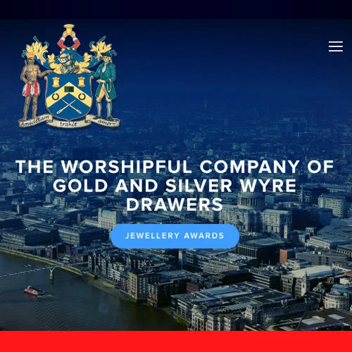
The Worshipful Company of Gold and Silver Wyre Drawers
One of the most exciting consequences of this project was that it directly put our UX Designer Greg Campbell & Creative Director Alex Bremer (ably assisted on occasion by coding input from Jordan Worner, Tom Getgood & Jack Bremer) right back at the “coalface” for the first time in a long while...
3B are renowned for delivering web projects almost exclusively on Open Source platforms – most especially Joomla, Drupal & Wordpress. Every now & then, however, budget & timeline constraints suggest to us that an alternative CMS might be the way to go.
In this case the decision to embrace a 3rd party platform was actually borne of a client’s desire to be contract-free post launch – a requirement that’s difficult to guarantee when ongoing support & maintenance of an Open Source platform such as those mentioned above is highly advised – and this led us to recommend and implement the wonderful SquareSpace CMS.
One of the most exciting consequences of this decision was that it directly put our UX Designer Greg Campbell & Creative Director Alex Bremer (ably assisted on occasion by coding input from Jordan Worner, Tom Getgood & Jack Bremer) right back at the “coalface” for the first time in a long while.
The Worshipful Company of Gold and Silver Wyre Drawers are a City Livery Company first incorporated in 1623 and received their Royal Charter in 1693 from King William and Queen Mary. Their practices and communication infrastructure were ancient and creaking and despite having an established and up-to-date website they were more than ready and willing to begin their Digital Journey properly with us. Consequently they have been a real delight to work with; the project has been delivered within a month and they’re pleased as punch!
The Squarespace CMS is not suitable for many of the projects we undertake – especially where bespoke functionality & component development is required – but when the desired site is essentially a simple collection of attractive, responsive and easy-to-update pages I’d say that SquareSpace is pretty much faultless. Rudimentary page passwords, ecommerce & multi-media embeds are simple and quick to implement and, importantly, aggressive timelines and tight budgets can be reasonably easily accommodated. We’re going to be releasing a few more of these in the coming weeks…
Marshall Arts
Our relationship with renowned international concert promoters Marshall Arts goes back some time now; starting with a new website back in 2010 and as time has gone by our offering to them has included highly successful Facebook Ad campaigns, Adwords, ticket distribution and broad Social Media strategising and actioning (including Facebook, Youtube & Twitter).
We have to be very flexible and fast-reacting to accommodate their needs ongoing; their tours and shows are frequently top secret in the run up to public announcements and can be subject to last minute changes and re-scheduling. To be fair we absolutely love this very aspect of Social Media and very much enjoy the theatrical element that comes with this “live” environment.
Consequently our asset & content creation and campaign strategy needs to be extremely rapid in execution… these guys really keep us on our toes!