Alex Bremer Alex Bremer

RSM International - a truly global presence

RSM had been a valued client of ours since 2013. When in 2015 they began their global roll-out of their new corporate brand, and we were delighted and honoured to be brought into the process right from the very beginning.

RSM International Global Rebrand 3bweb.com

RSM had been a valued client of ours since 2013. When in 2015 they began their global roll-out of their new corporate brand we were delighted and honoured to be brought into the process right from the very beginning.

We cannot over-emphasise the importance of involving your digital agency early in these matters; we were able to consult on matters relating most especially to SEO, site management (both central and local), goal conversion and brand consistency early enough that decisions relating to these key items were worked into the global strategy right from the outset.

The decision reached was to launch over 80 sites in one day, all on the Drupal Open Source platform, managed from one central code base so that any template and functionality changes could be rolled-out across all the local sites at once (subject to our stringent testing and deployment processes).

As well as the obvious scale of this project challenges included an aggressive timeline, multiple site languages, maintaining SEO rankings on the new domain structure.

The result is a clean and fast responsive collection of sites that will feature heavily when presenting case studies and portfolio work to new prospects and clients, and a relationship with a client that we value very highly as we move to new phases of deployment and app development.

Going forward we now support over 130 of RSM’s site administrators in multiple time zones around the world.

Visit the RSM website here >>

Read More
3B Digital 3B Digital

A new Squarespace 7.1 site for Purdie Pascoe

The challenge here was to transpose the look and feel of an existing Joomla site that we'd built for PP years previously onto what can be a fairly restrictive template (at least in terms of complete layout and styling freedom).

Purdie Pascoe is a medical devices market research company with a truly global reach. As clients, friends and neighbours here in Battersea, they’ve been trusting us to take care of their Digital Marketing for over 10 years now.

The original Squarespace challenge - a few years ago now - was to transpose the look and feel of an existing Joomla site that we'd built for PP some years previously onto what can sometimes be a fairly restrictive template (at least in terms of complete layout and styling freedom).

The client quite rightly wanted to enjoy their existing design but with an easier and more intuitive CMS as well as decreased maintenance and hosting costs and what we achieved was a near perfect facsimile of their previous site (whose design the client was very attached to) without having to resort to too many CSS and Javascript overrides

Since then Squarespace has moved on leaps and bounds and with the recent release of Squarespace 7.1 we took the opportunity to redesign and build a brand new site that benefits from better navigation and user journeys. The new site is a far simpler affair that also delivers a far more sophisticated and appropriate face for their business.

Take a look at our work here >>

“Our relationship with 3B goes back a decade. In that time we’ve grown as businesses together, and it’s been reassuring to know that 3B have been in our corner every step of the way.

A recent rebranding exercise was greeted enthusiastically by their team and we were gratified that our new ID could so easily and quickly be adopted by our site’s existing CMS.

3B are a trusted and valued addition to our marketing team.”

Stephen Potts, Director, Purdie Pascoe

Read More
3B Digital 3B Digital

Event Branding for The Africa Debate 2020

A lovely challenge, this; a branding that speaks of a geographical location can very easily become a stereotypical & patronising rendering that misses the fundamentals of the proposition… in other words, it can all very quickly look a bit “touristy”..!

A lovely challenge, this; a branding that speaks of a geographical location can very easily become stereotypical & patronising and miss the fundamentals of the proposition… in other words, it can all very quickly look a bit “touristy”..!

The Africa Debate is a flagship event of Invest Africa - a key forum, hosted in London, that brings vital decision makers and business leaders involved in the development of the Continent.

We were delighted to be invited to produce a brand ID for the show that would speak of the event’s contemporary weight and importance whilst retaining a look and feel that was clearly “of Africa”.

Accordingly our designer Greg produced a number of variations the continent’s instantly recognisable profile using colours that in anybody else’s hands can quickly become flat and tepid.

We’re delighted with the results, and more importantly so is the client!

“The 3bweb team were incredibly easy to work with and produced some excellent designs for our annual conference. They took the time to understand our brand identity and were very responsive throughout the process making sure we got a logo that reflects who we are as a company.”

Eleanor Brown, Content Manager, Invest in Africa

Visit the Africa Debate website here >>

Read More
site build, site design 3B Digital site build, site design 3B Digital

The Watercolour World - a truly immersive experience

A genuinely fascinating and engaging project, this; a presentation of a database of painted works so immersive and layered as to hold our professional and personal attention pretty much solidly for the last 7 months.

A genuinely fascinating and engaging project; a presentation of a database of painted works so immersive and layered as to hold our attention solidly for the last 6 months of 2018.

The Watercolour World is a UK Charity set up specifically to digitally document as many global pre-photography documentary watercolours as they can realistically lay their hands on - an ongoing (and hopefully never ending) project to preserve these academically invaluable assets for future generations.

Watercolour World were already one website into their lifecycle when they came to us; it had become apparent that theirs was a proposition with considerable “heft” - that delivery of their content, and the many and varied means by which that content should be navigated, required calling in the big boys (us) to deliver their rapidly expanding database of high-resolution artworks through an intuitive and engaging website.

This was a rapidly developing proposition in terms of scope and technology; the commissioned Minimum Viable Product very quickly became something quite polished and slick - not least because of the technology we chose to employ to deliver key assets and facilitate search.

By the time of launch The Watercolour World took delivery of a fully functioning online database of many tens of thousands of stunning paintings - all indexed and searchable by numerous means; tags, fields and of course the marvellous map.

Read More
3B Digital 3B Digital

Representing the digital brand of the racing driver Perry McCarthy

Personal brands are understandably emotionally charged personal statements by the protagonists and digital and design agencies tread carefully where content, look and feel are concerned. But 3B saw this as a terrific opportunity to make a bold statement of intent in what is a growing market of sports personalities looking to maximise exposure online.

Perry visiting 3B in February 2019

3B are delighted to play a small part in the ongoing story of this most remarkable of professional racing drivers.

3B offered to revisit Perry’s digital presence on condition that they were trusted to build an optimised site that would deliver managed and manageable content in the most accessible way possible, ensuring site goals and conversions were optimised and tracked along the way.

Personal brands are understandably emotionally charged personal statements by the protagonists and digital and design agencies tread carefully where content, look and feel are concerned. But 3B saw this as a terrific opportunity to make a bold statement of intent in what is a growing market of sports personalities looking to maximise exposure online.

Thankfully Perry understood what we were looking to achieve here and has trusted us implicitly to deliver on our promise. The build wasn’t difficult or lengthy; we used the wonderful and increasingly configurable cloud-based CMS, Squarespace - a truly powerful and rapidly deployed platform that serves all but the most demanding brochure-site requirements. Design was very much led by the well-established Perry McCarthy brand and the high-quality images and video that he has at his disposal.

3B Digital is proud that Perry has placed this most valuable asset in our hands and we feel sure that the site at www.perrymccarthy.co.uk will help him better serve his broad and disparate interest groups.

Visit Perry’s new site here >>

Read More
3B Digital 3B Digital

RSM - Stunning Interactive Page To Become A Simple "Touch Screen" App

This single page interface we recently deployed on the RSM Global site has proved extremely popular and successful. We were delighted to see it being demonstrated to their Internationally dispersed members & employees during their recent World Conference.

This single page interface we recently deployed on the RSM Global site has proved extremely popular and successful. We were delighted to see it being demonstrated to their Internationally dispersed members & employees during their recent World Conference.

A nice example of how a responsive and accessible site (that is optimised to work on phones and tablets) can also serve as a large format touch screen interface... we love that!

Read More
3B Digital 3B Digital

Air Partner's Jetcard US Microsite using Squarespace

Theirs are not the kind of customers who are willing to accept bugs or slow loading pages because their time is too valuable. For this reason we realised that Squarespace would provide the ideal backdrop for a responsive and unique theme, without compromising on the feel of the site.

When Air Partner came to us they told us briefly what they wanted:

  1. A site which would look completely unique.
  2. A site which would leave a lasting impression on their younger current and potential customers.
  3. A site which wouldn't also alienate their loyal customers.

We knew that they'd want an easy admin interface and Squarespace provides that in buckets so we dived straight in. The template Squarespace provided us with was completely ripped apart, reshaped and moulded into the unique site you can see today at jetcard.airpartner.com.

We kept all the features which created an immersive experience like the full width videos and images, then imprinted the unique AirPartner brand upon it.

Consider for a moment the kind of clientele suited to a private jet subscription service with the following perks:

  • Guaranteed availability in as few as 24 hours' notice with no blackout dates
  • Flight credit that never expires and fully-refundable account balances
  • 24/7 global coverage year-round

Theirs are not the kind of customers who are willing to accept bugs or slow loading pages because their time is too valuable. For this reason we realised that Squarespace would provide the ideal backdrop for a responsive and unique theme, without compromising on the feel of the site.

Despite the designs being chopped and changed throughout the creative process we have found the perfect balance between one-of-a-kind and functional.

We look forward to working with and advising on AirPartner's greater family of sites in the years to come. 


Read More
3B Digital 3B Digital

A new website for the Old Brightonians - the Alumni of the Brighton College

The brief was essentially very simple: maintain current functionality and content and migrate to the latest version of Joomla and a new fully responsive template.

We've been building and maintaining sites for Brighton College's Alumni since 1998. The last few iterations have all been on the wonderful Open Source Joomla platform and this latest version is no exception.

The brief was essentially very simple: maintain current functionality and content and migrate to the latest version of Joomla and a new fully responsive template - a process we're well used to and which normally runs smoothly and without too many issues.

The new site dovetails with their new Alumni database site (on Graduway) and neatly embeds their event booking system, meaning that the Joomla CMS isn't doing too much "heavy lifting" beyond the delivery of what has become a vast and varied body of tagged content across many categories. The challenge on sites like this is ensuring that "busy" doesn't become "cluttered" and I think with this client we've always achieved that, even going so far as to frequently demo the work to prospective and existing clients as a good example of content delivery.

The site - and its many versions over the years - also serves as a great indictment of this wonderful CMS; in many ways Joomla is far less configurable and versatile than Drupal, but when budget, time and client familiarity dictate it remains a popular and well proven weapon in our arsenal.

Visit the new work here >>

Read More
Alex Bremer Alex Bremer

Royal Albert Hall Kiosk App

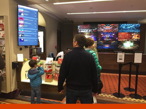
The joint efforts of The Royal Albert hall & 3B Digital to make the public spaces at the venue more interactive, informative and dynamic continue unabated with the design & implementation of a wonderful new Kiosk Interface of the live “What’s On” data.

The joint efforts of The Royal Albert hall & 3B Digital to make the public spaces at the venue more interactive, informative and dynamic continue unabated with the design & implementation of a wonderful new Kiosk Interface of the live “What’s On” data.

The challenge was to take feeds from the existing website’s data, filter and style to present on a “rolling” vertical screen within the Box Office area at the Hall.

The pages are shown on a simple Chromebit plugged into the big screen showing the webpage built with AngularJS, a JSON feed from their website and the excellent Kiosk Chrome App.

We know the result has been well received because while Jack was on-site supervising the installation he was surrounded by fascinated by Hall visitors eager to see what’s coming up!

Read More
Alex Bremer Alex Bremer

Motor Sport Magazine new site template & content migration

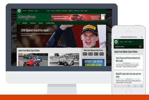
The "End Game", or at least the beginning of the "End Game" as regards the "digital unification" programme for Motor Sport Magazine has been to migrate the pre-existing content from Wordpress to the new Drupal installation.

The "End Game", or at least the beginning of the "End Game" as regards the "digital unification" programme for Motor Sport Magazine has been to migrate the pre-existing content from Wordpress to the new Drupal installation.

The result has been a truly unified digital presence that now encompasses the entire Motor Sport content offering on one consistent & elegant template, allowing for a uniquely diverting & immersive browsing experience.

Ongoing we'll be looking to bring aspects of their shop and subscription pages within this new design, as well as an active monthly programme of site improvements, but for now the extraordinary wealth of expert content is brilliantly navigable - we're proud of this work!

Read More
Alex Bremer Alex Bremer

Royal Albert Hall’s “Peter Blake app”

Back in May we were really delighted to be approached by the Royal Albert Hall (RAH) in relation to a wall mural they’d commissioned from Peter Blake. The mural featured over 400 of the most famous artists to have appeared at the historic venue over the years.

Royal Albert Hall’s “Peter Blake app” — 3B Digital - Joomla, Drupal & Open Source marketing experts

Back in May 2014 we were really delighted to be approached by the Royal Albert Hall in relation to a wall mural they’d commissioned from Peter Blake. The mural featured over 400 of the most famous artists to have appeared at the historic venue over the years.

The Hall provided a perfectly open brief that allowed us to bring both creative and practical disciplines suitably early in the project lifecycle. It’s exactly this level of involvement with clients that allows 3B to shine; we really appreciate it when clients trust us to help them take a “whacky” half-formed idea and mould it, with them, into a solid, deliverable tool that often serves a purpose greater than its original brief.

Essentially, our brief was to deliver an online interface that would work on mobile, kiosk and desktop. The site would be fully responsive and manageable by Hall staff constantly updating and amending the content held on each artist who is featured in the mural.

We had quite a challenging timeline on this project and we really threw ourselves at it, design through to launch, and it’s now delivered through two static kiosks in the Café Bar at the Door 12 entrance of the Royal Albert Hall as well as on mobile devices and computers via http://appearing.royalalberthall.com/.

We’re really delighted with this project; working closely with a terrific client that had realistic expectations and a truly creative flair we were able to produce an essentially simple and elegant interactive interface that will serve as a platform for “gamification" and enhancements going forward.

Read More
Alex Bremer Alex Bremer

Mediatek

The work we did for MediaTek, a global leader in system on chips, was commissioned by Prophet, a global brand and marketing consultancy. We have worked with Prophet on a number of high-profile digital projects – all of which have required our custom development, technical strategy and design input – and the work with MediaTek was an especially enjoyable and satisfying project experience.

The work we did for MediaTek, a global leader in system on chips, was commissioned by Prophet, a global brand and marketing consultancy. We have worked with Prophet on a number of high-profile digital projects – all of which have required our custom development, technical strategy and design input – and the work with MediaTek was an especially enjoyable and satisfying project experience.

Essentially we were asked to deliver a single-page dynamic site that featured examples of their “everyday genius” as explained in videos and written content. This content would be navigated to from a drawn “cityscape” that featured animated elements to bring it to “life”.

We were delivered beautiful layers of the cityscape and a number of animated elements that we were free to place and move on the page at our discretion. Key hotspots triggered pop-up style vignettes featuring video content.

We consider this project a resounding success delivered on budget and to a tight timeline – we look forward to our next project with our great friends at Prophet.

View the interactive map build.

Note: link is not HTTPS.

Read More
Alex Bremer Alex Bremer

The Stationers' Company

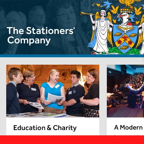
The Stationers' Company is the City of London Livery Company for the Communications and Content industries – could we have hoped for a more perfect fit with 3B?

The Stationers' Company is the City of London Livery Company for the Communications and Content industries – could we have hoped for a more perfect fit with 3B?

The Stationers are lucky enough to own their own Hall – a major revenue stream for them, as well as a truly beautiful & historic City location from which to be based. This meant that their site had to be far more than just a news source for their membership; it needed to serve as a sales tool for their venue administrators – showcasing this extraordinary place with high quality images and clear conversion paths in a fully responsive and optimised site.

Our solution has delivered a lean and elegant site that will provide The Stationer’s staff with an easy administrator’s Joomla portal from where they can update content relating to both their member base and potential venue hirers.

Read More